This lesson task is a part of the course assignment for Graphic design 2, also called CA08. It consists of 4 parts, where logo design is the first one. The logo is the result of the creative workflow I am to explore during this project.
The theme of the project is dog food and the first task is to come up with a name for a dog food brand. I did some brain storming with words that describes a dog. I picked a few I liked the most and tried to match them with other words associated with dogs.
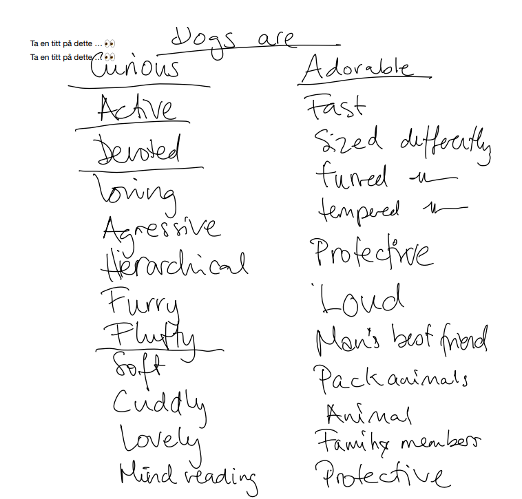
I tried to combine them with the words “puppy”, “Fido”, “canine”, “pal”, “dog”, “Cain” (a dog’s name), “anime” and many others in order to come up with a unique dog food brand name. My favourite was Curious Canine, but somebody had thought the same. Curious canine is a dog trainer. Then I thought of Fluffy Fido or Furry Fido, but both of them were taken. Then I thought of synonymes for dog and came up with Canis. Canis is the latin name for dog, and the brand name Curious Canis was born.
I wanted a logo with both a logo mark and a logo type in combination, and I explored the options for the logo mark first by drawing some rough skretches on my iPad. These are small thumbnail drawings. When making the drawings small, you don’t get hung up on details.
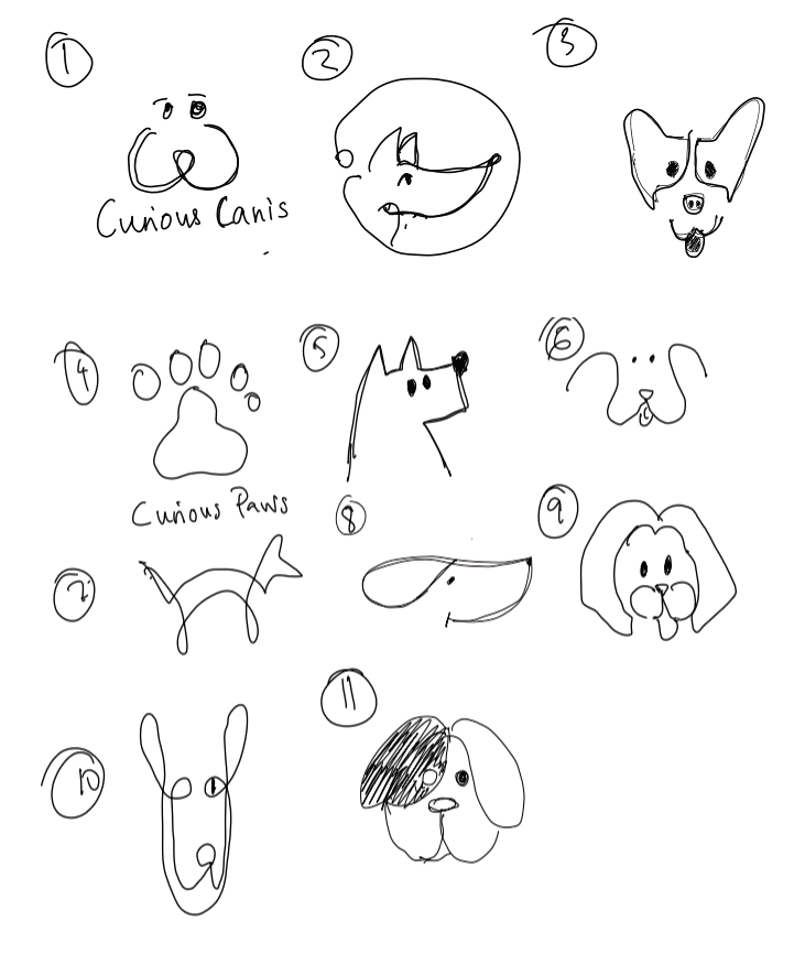
I picked 3 of the ones I liked the most and digitalized them
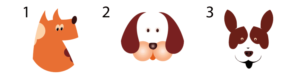
Number 1 because he looks curious. He is awake and alert and pointy – not as soft as the others. Number 2 because this is a common dog with nice eyes and large ears. Nice is good for dogs. My favourite is number 3 because it does not contain a whole dog shape. Parts of the head is missing, but it does not stop us from identifying this as a dog.
I asked some friends of mine on facebook what they thinked and why.
Typography is also an important part of a logo. A font can tell a story, identify a brand and communicate values. I tested out some fonts to see how the brand name looked in various types.
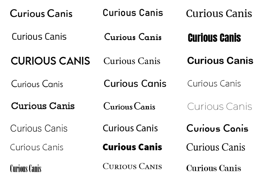
When designing for a brand that should have real word physical products, it is important that the font that is used can be printed and still be legiable. The really thin line fonts and the tight fonts are therefore not a good choice. Only minor printing errors can lead to them being unreadable. I ended up with Reross Quadratic, an Adobe font.
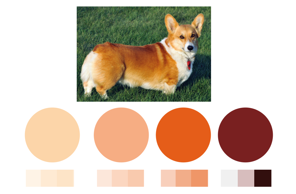
Colours can also convey a message and set a mood, and I created a colour palette based on the colours of a Welsh corgey (a dog breed). I found the image om Wikipedia.
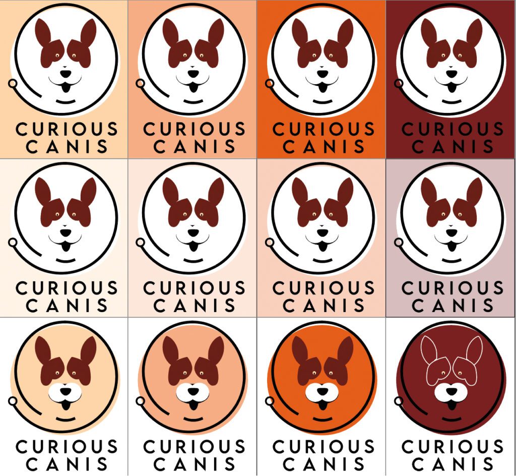
This is my final logo
The background colour can be changed to any of the main colours in the brand palette
For those interested, this is the pdf with my notes and sketches. It is done in Notability.