For those of you that doesn’t bother to scroll down to the bottom, here is the pdf file
Brief
The brief of this project is described as follows:
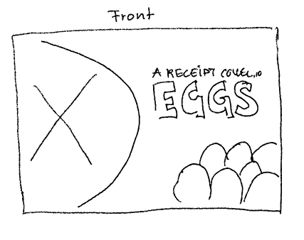
The Enlightenment Office (OEK) for eggs and meat wants to create a recipe booklet targeted towards students and young adults. The booklet will contain content about eggs – a cheap commodity with infinite possibilities. The booklet should have a front and back cover, a preface, content repository, recipes and contact information. Please see the attachment for the text to use. You are not allowed to edit the text whatsoever. Your can get your images from any of the free (or paid) stock libraries online. Remember to add a credit where necessary.
About the Information Office for Eggs and Meat
The information office for Eggs and Meat (Opplysningskontoret for egg og kjøtt , in Norwegian) is a Norwegian marketing organisation that aims to provide vendor funded information and help on behalf of the Norwegian meat industry, for products made by eggs and meat [1] [2]. The office runs the website, matprat.no, where they provide information about their member’s products and recipes in various origins and food type[1].
Target Group
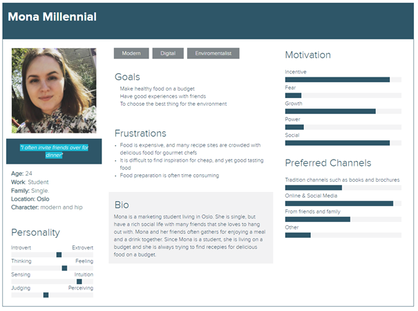
The scope of the project is to make a recipe booklet containing 5 recipes where eggs are one of the main ingredients. The target group is young adults and student. In order to know more about the target group, an informal interview with a young woman in the target group was performed
Based on that chat, I developed a persona. My persona is 24 years old, single, lives in Oslo and is studying marketing at NMBU. She sees herself as modern and hip, and she uses eggs in her cooking regularly. Although her economy is not the best, she says that she always have enough money for a package of eggs.
The persona is developed using an online tool, called Xtensio [2]
Inspiration and Ideation
Before sketching anything it may be smart to see what others have done and find inspiration in that. I looked at a few cook books that I had in hand, and found some inspiration in my cook book on Keto [3]. I also looked in brochures from Kiwi and Rema (local grocery stores), but theirs were full of product promotions and prices.
The Keto book is clean and easy on the eye, in my opinion, with a clear 3-grid that I liked.
I also browsed Envato Elements[4], where I have an active subscription, for images on “eggs”, “chicken”, “cooking with eggs” and for each of the recepies, I used Envato Elements to find the appropriate image to illustrate the dish.
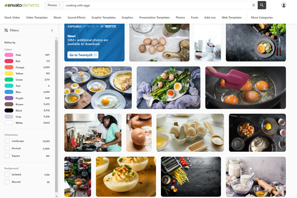
Figure 1 Screenshot from Envato Elements and the query Cooking with eggs
I also found this image; the shape of a fried egg. The idea was that the outline of the egg could be a graphical element in the piece.
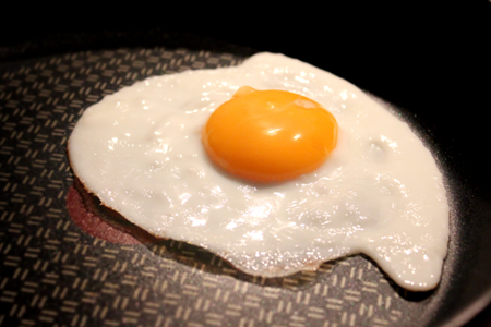
Figure 2 The shape of a fried egg
Moodboard
I put some images together on a mood board. The idea of the mood board is to see how to convey a modern feeling to cooking with eggs and explore the colours of such.
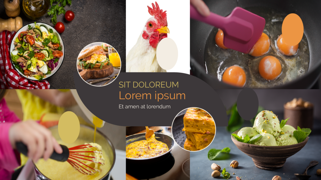
From the images, I found 4 colours that I could use in my design.
Colours
The colours extracted from the images are as follow
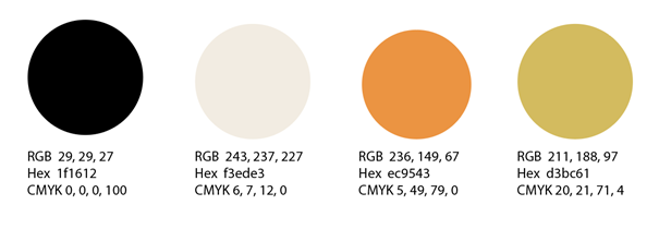
The dark colour is suitable as background colour. The black colour may convey a modern feeling to the piece, while the orange and yellow makes it a little more fun. The white-ish colour is intended for body copy (the ingredient list and the procedure description) and the orange and yellow for headings and sub-headings.
The contast between the dark and the light colour ensures readability. The colours are specified in RGB, HEX and CMYK. Since Pantone colours are very expensive, and since the photographs have to be printed using CMYK, there is no need to use Pantone Colours in the palette.
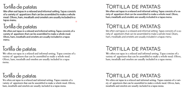
Typography
The look-and-feel for the piece is modern and fun, and I needed a typeface that could convey that feeling. In order to explore typefaces, I set-up a document in Illustrator and compared typefaces.
Characteristics that should be captured:
- “Fun” a typeface with a hand-written style
- “Modern” a sans-serif typeface
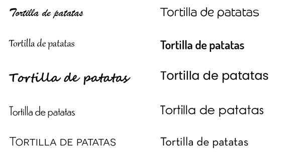
The “fun” was not stylish enough, in my opinion, so I decided that the typeface for heading should be a sans-serif typeface. On Adobe Typekit I found the typeface Dunbar, which had 28 different weights and styles included – aka many options for variations within the same family. I also chose Novecento Sans for the same reason.
To explore options for body-copy, I paired different typefaces with Dunbar and Novicento Sans – some using sans-serif typefaces and others with serifs.
The Novecento typeface can only make caps and small caps, and that can compromise readability.
When combining typefaces, it is common to either use the same family on both headings and body-copy or use a sans-serif on headings and a serif typeface on body-copy (or vice versa). I liked the way Dunbar looked, and due to it’s large variety of weights and styles, I decided to use this in my piece.
Concept and Sketching
When look-and-feel, colours, typography and style was in place, I started sketching. The sketches was executed on my Remarkable, a note-taking tablet that is also suitable for drawing.
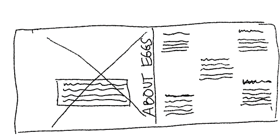
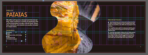
In the brief, it is stated that the recommended format was A5, portrait. Since this was only a recommendation, I decided to go with A5 landscape with bindings on the short end. Based on the layout from the Keto cook book, I sketched a 3-grid layout, where the idea was that the ingredients list was granted 33% of the space and the procedure description should have the remaining 66% of a single page One recipe on each spread and the photo should occupy a full page, bleeding into the edges.
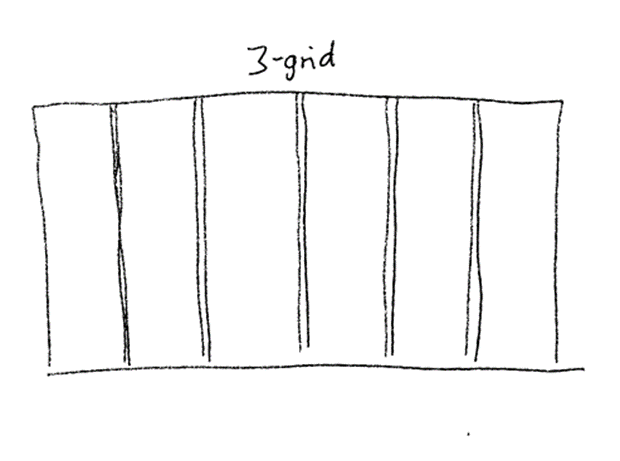
Figure 3 The spread, with a 3 grid
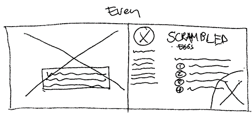
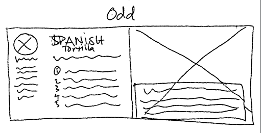
The idea was to use a simple and predictable layout where every recipe spread was equal (and mirrored) with squares and lines as the main element.
Execution
My initial set-up in indesign was print A5 landscape 210mm x 148 mm, CMYK colour profile. I set the document bleed to 3mm and top and left margin to 10 mm and right/inner and bottom margin to 20 mm. This ensures that the information is not squished into the right edges and the pages are not so bottom heavy.
My initial grid was 3 colums with 4,2 mm gutter, and guides in 3 rows with 5mm gutter. I soon realized that a 3 column grid was not flexible enough, so I increased the number of columns to 9. With 9 columns, I could still use it as a 3-grid, but also had the flexibility of placing elements on 6 other places without loosing the grid.
The row guides were used to place elements on the horizontal level. I did not use line guides. The text floated with the spacing provided with the font size and line-height.
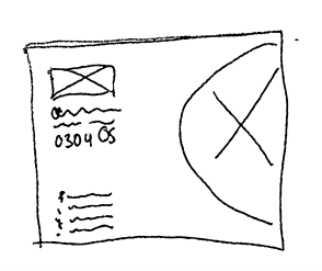
The columns, gutters, margins and rows was set-up using a master page. On this page, the background colour and page numbers was applied, so that I did not have to insert these elements on every spread.
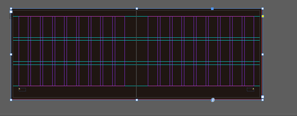
Figure 4 A master page
In Indesign, the page number is automatically removed from the first and last page, and also from pages where images bleed to the edges.
The initial idea was to use a simple and square look-and-feel, but after placing the elements for one recipe, I found that quite boring – so I applied the shape of the egg outline – aka curvy image and text frames to the piece. The images are curvy both horizontally and vertically.
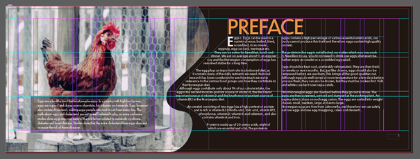
Figure 5 Curvy frames for text and images
On the spread with the various cooking methods for eggs, the goal of the images and text was to follow the rhythm provided in the horizontal image on the bottom.
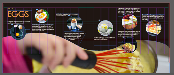
Figure 6 Curvy image frame horizontally
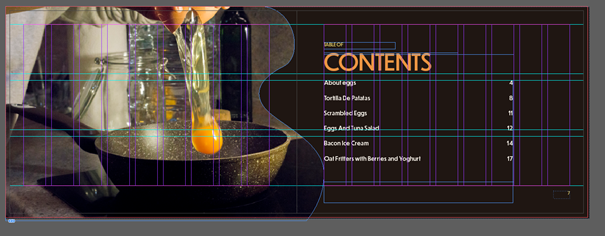
I decided to split the heading into two – a small part in yellow and the main part in orange. I like the way it looks, but it caused some trouble when I tried to generate the table of contents. Since a table of content is based on a character style, only parts of the heading was retrieved. I had to manually insert the rest and style it. I use tabs to place the page numbers.
The elements are aligned to the grid most of the time. In the following screenshot, the heading is aligned to the first guide at the bottom, and the ingress and the ingredients list follow aligned to the top of the next guide, with 5mm spacing between unrelated elements and 2mm between related elements. By unrelated elements I here mean the ingress in relation to the ingredient list. The ingredient list has a heading and a list that belong together and is therefor a related element with 2mm between the heading and the list. This spacing of 5mm and 2mm is consistent. The spacing between paragraphs is 2mm.
The procedure description is a numbered list in the recipes, and the various steps has a drop cap of 2 lines and 2 characters.
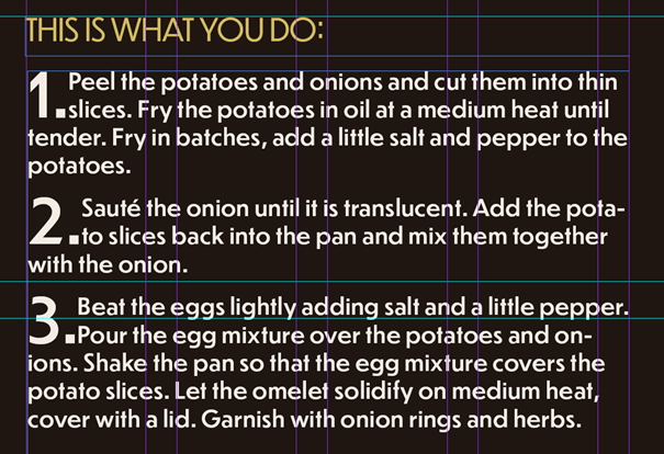
The numbering is now a visual element that makes it easy to identify the different steps.
The font sizes in the piece is based on a 9-system: the body copy is 9 pt. The sub heading is 9pt, the heading is 5x the base = 45 pt. The text in the tip container is 75% of the base.
The final result
Reflections on the process
I have learned a lot during this process. First of all, it is difficult to plan a piece when I cannot imagine it. As described earlier, I thought a 3 grid was great for this project, but it turned out to be not flexible enough, so I had to change it. I don’t have enough experience to feel these things (yet). To plan for a project like this is very challenging. I have ideas in my head, and they look fine on sketches, but when I do them, it turns out not what I expected. In this project, the brochure has gone through many changes I didn’t anticipate when I first started and did not plan for.
References
[1] Wikipedia, 2020. Opplysningskontoret for egg og kjøtt. Online. URL https://en.wikipedia.org/wiki/Opplysningskontoret_for_egg_og_kj%C3%B8tt Access date 10.02.2021
[2] Wikipedia, 2020. Opplysningskontoret for egg og kjøtt. Online. URL https://no.wikipedia.org/wiki/Opplysningskontoret_for_egg_og_kj%C3%B8tt Access date 10.02.2021
[1] https://matprat.no
[2] https://xtensio.com/
[3] Keto by Jane Faerber from Memo Publisher
[4] Envato Elements (elements.envato.com) is a service that provides images, graphics, templates, video, music and more. Some of it is free, and others requires a subscription.