I chose a brochure from a hotel I once stayed at. I kept this brochure because I liked the layout back then and wanted to use this as an inspiration for my own print work later. Now I’m not so sure.
At first, it looked like tracking grid lines would be easy. The piece consists of rectangles and squares, in a seemingly ordered fashion.
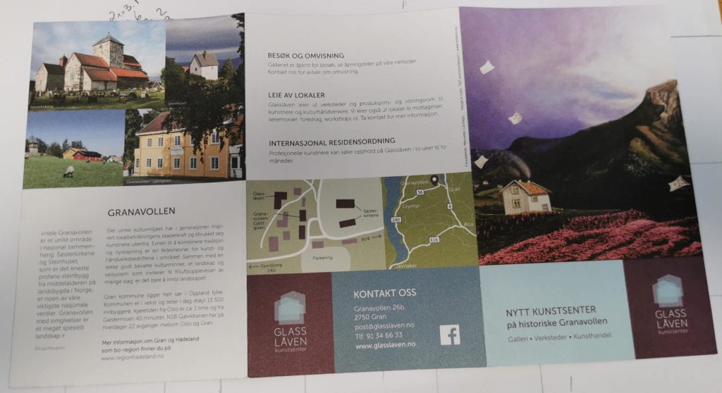
The outer format of this piece is 122 by 198mm, which gives the brochure a propoprtion of 1,6. The inside of the brochure is 9,8 with outher margins of 12mm. And then the kaos starts.
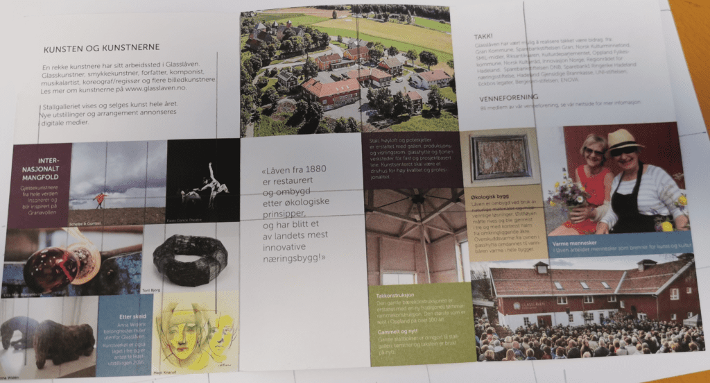
The inside looks as a 5 grid. This I found by adding a line through every vertical line provided by imagery and body copy on the top on the first spread. However, 5 grid or not; the images and text below do not comply to this grid. On the first line, the first two grids are 18 mm wide, the third is 20 mm, the fourth is 10 mm and the last is 26mm. It does not get any better on the other rows.
On the front page of the brochure, it looks better at first glance, but no.
These pages has the same content zone and margins as the inside. However, the off-grid content is still present on this spread – with the imagery on top and on the back page of the brochure, you have two rows of elements that looks like they are mirrored. They are not. The widest element on the top row is 73mm and on the bottom row, the equivalent element is 77mm. You also have elements that looks like they are mirrored on the front and back page. They are not. The difference is small: 1 mm and perhaps not visible, but it is there.
It may be so that this off-grid layout is by design. I still like the brochure and it does not hurt the eye even though the grid is non-exisiting or elements consistently are placed off-grid. However, a grid is a way of aligning your elements to the page on a vertical axis and consists of a column size and a gutter size. You can also have a horizontal lines to place your content on. The grid helps you to order your layout so that it is consistent and clean. This does not mean you have to comply to only symetrical square shapes in your layout. You can go off-grid, but when you do you have a reason and a thought behind it. In this layout, the off-grid measurements are 1-2mm and does not contribute to any off-grid layout. It only appears sloppy and amateruish.