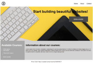
I have never beed good in obeying rules, so I chose to do this a little bit different: I used a client of mine, Wolverine Adventures – a small guiding service business in Trysil, run by Karl Jørgen. I designed and implemented his website a few years back – take a look!
A couple of times a year, Karl Jørgen creates a brochure that he sends to his connection in Europe, and so my tourist brochure could gain actual use, and that’s why I chose to use real images, real headings and real texts.
I still have some trouble with designing the layout on paper before I move on to Indesign. I have no idea how big a text frame has to be to contain all text I want in it, so even if I draw a nicely balanced text-image ratio, when I get work in Indesign and then fill the frames with actual content, it never looks like my sketches.
Anyway. This is my finished pdf.
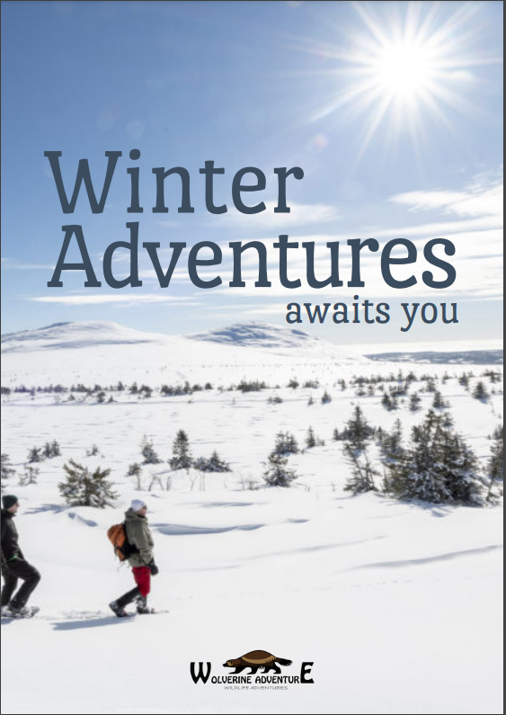
Karl Jørgen has proof-read it, and it is sent to his connection in Netherlands and Germany. He was super happy with the end result and the notion that my brochure is used professionally makes me happy.
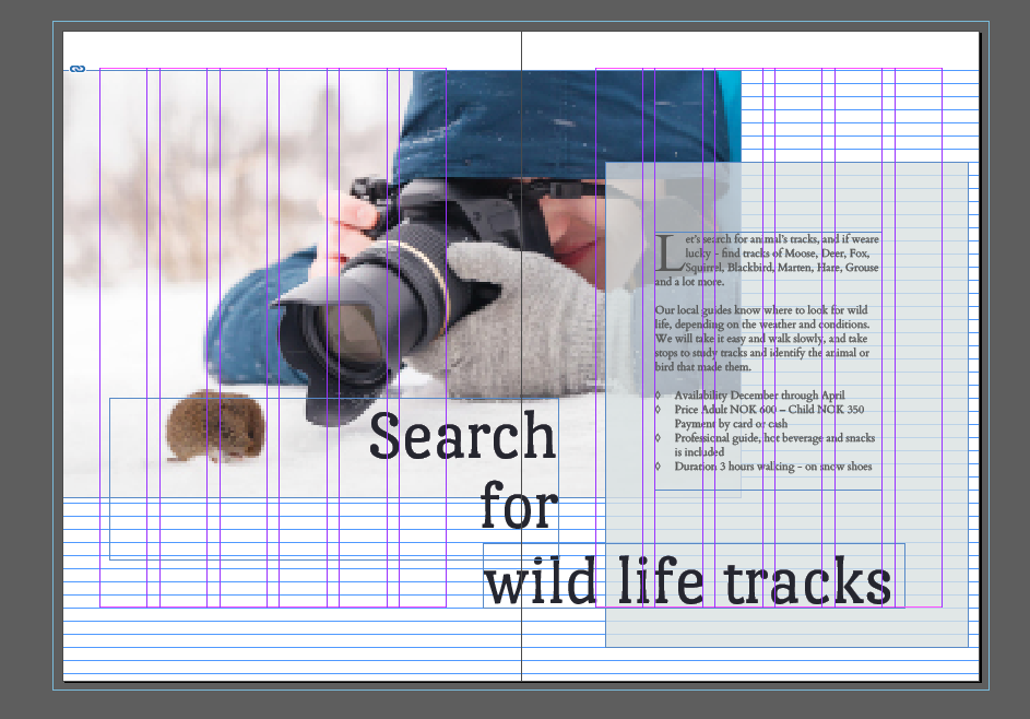
The document setup is A5 Portrait (148mm x 210mm), 6-grid layout with 4mm gutter in between. The pages has an inner and bottom margins of 24mm, and outer and top margins of 12mm. According to Nigel French, a lecturer at LinkedIn learning, larger bottom margins makes the pages look less heavy, and a larger inner margin makes room for bindings.
The pages are organized as spreads, and the front page image continues on the back.
I learned the hard way that organizing my files for a particular work is super important, so I created folders on my drive – one for images and one for texts. I found that the images are especially important to keep organized, since I link them in the document, and if the link is broken – for whatever reason – I need to relink them, and if I cannot do that, the image must be replaced. In this task, I didn’t link the text, but you could do that as well, and then organizing of texts would be equally important.
The colours of the brochure are mainly picked from the images I have used. The typography is from the website, in order to make the brochure consistent with the website.