In this task, I’m going to look at how an established well-known brand employs their brand identity. To do this, I’ve visited their website, nikita.no and looked in one of their shops in a supermarked near by.
Nikita Hair is a Norwegian hair dresser establishment, one of Norway’s largest store chain hair dressers. Their history goes 30 years back, and they claim they have cut millions of people since the beginning. Their founder, Inger Ellen Nicolaisen, have won alot of prices for her work with Nikita Hair and their hair dressers have won prices too.
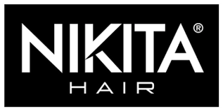
Their logo is a word mark with the word Nikita Hair, in a white sans-serif typeface on a black background. The typeface is slightly altered in the letter K, where a cut is done into the character. The word Nikita is done with very little kerning between some of the letters: the K and I, the I and T and the T and A even overlap. In the word Hair, it is done in a different typeface, with a very different letterform with a small x-height.
I found nothing about the history or other brand identity tools on their website. This does not mean they don’t have a visual identity brand book, but it is not publically available online.
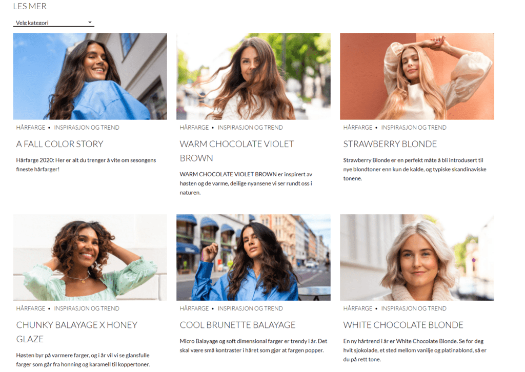
On their website, the main feature is to book an appointment. Besides that, they have inspirational images of nice hair cuts and beautiful people. They also have a loyalty program, and they claim that over 80% of their customers would reccomend their services.
The overall look on their website is black and white, minimalistic in look and very modern – with one exception:
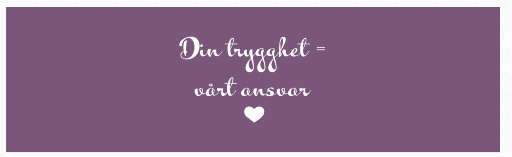
I am not sure if this is according to their brand identity. The color is nowhere else to be found and the typeface is nothing like anything else on their page. This might be an expression of the extraodinary times we are in now, with Covid-19 pandemic. This typeface, color and icon usage envokes feelings of being cared for more than a black/white version in Lato typeface would have done. On the other hand, I also found this typeface on posters in the shop so perhaps it is part of their brand. In my personal opinion, the typeface combination is surprising.
I also visited one of their salons in Elverum. To get acceptance for both looking without being a customer (for the moment) and photographing the salon was NOT easy.
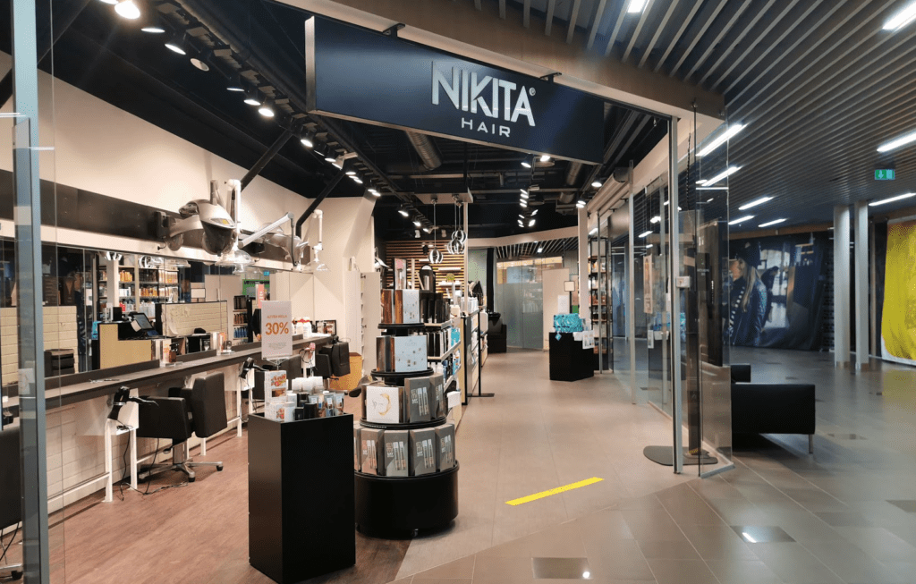
The online precence of Nikita Hair is black/white and minimalistic – and so is the salon. The interior is black and modern with no excess details on furtiture or other objects. No objects were purely decorative.
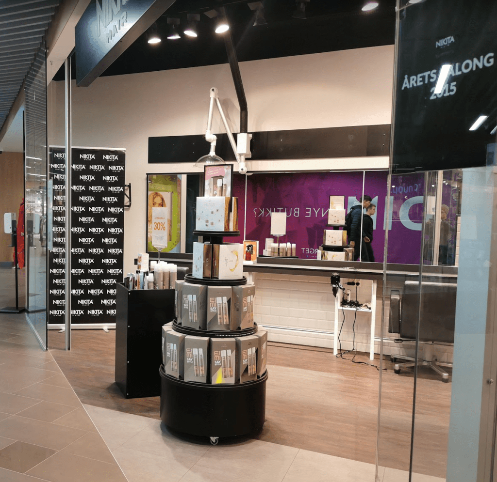
I also found a poster for some hair styling products
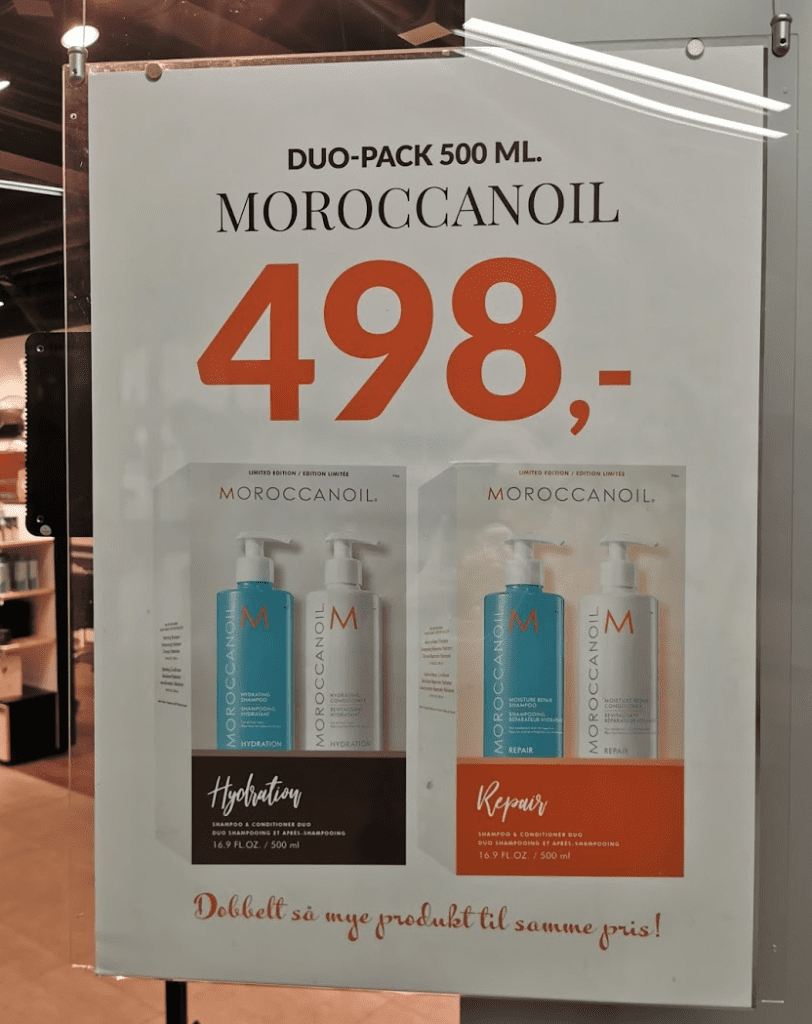
This poster for Moroccanoil has a different look and feel than anything I’ve seen on their website. It introduces two new typefaces: a serif typeface (on the product name), a sans-serif for the product description and the price in addition to the already mentioned display typeface as the sales punch. Neither the serif or the sans-serif typeface is nowhere to be found anywhere else. I wonder why they have done it in such manner.
My conclusion on this matter is that the branding ideals of Nikita Hair is minimalistic, pure and modern. This is displayed using a color palette of primarily black and white and a sans-serif typeface with medium x-height. They also want to let customers konw that they care, and introduces an accent color – in this case purple (or other accent colors) to communicate this. To enhance the caring aspect, a curly display typeface to emphasize the caring aspect or to sell products.
For the confusing part of their brand, the rounded sans-serif and a serif typeface used in product posters – would really like to know the rationale for introducing these two into their brand. In my opinion, it does not add extra value or communicate something extra. It looks more like a random choice of typeface usage in a design.
I think the poster is chain made, meaning that the Nikita Hair in Elverum did not design this by them selves. I would know this for sure if I visited other Nikita Hair salons elsewhere.