When we perceive colours it is because light of a certain wavelength is reflected from the surface of an object. A red surface is red because the red light is reflected and the other wavelengths are absorbed.
There are many ways to describe colours. Itten was the first to describe colours in a systematic way. He created the colour wheel as many of us know from school, with red, blue and green as primary colours. Primary colours are colours that cannot be mixed by using other colours. Secondary colours are colours mixed by using two primaries. Tertiary colours are mixed using one primary and one secondary colour. This colour model uses pigments as base. In the digital world this way of describing colours is not useful. Here, colour gammuts made of light from a digital display or ink are more propriate.
First some terminology: hue is another term for color, such as red, green, blue, orange, bluegreen etc. Hues come in different shades (added black) and tints (added white) and with different intensity (or saturation). A tint of red could be named “salmon red”. A shade of blue could be “ocean blue”. A saturated blue could be “royal blue” and a more dimmed version could be called “gray blue”. The hue are the same, but the level of white or black, and saturation vary.
The colour model for computer screens is the RGB colour model, where red, green and blue are primary colours. By mixing these three colours in various amounts, you get a colour gammut of over 16 million colours. This is not all the colours found in nature and other colour models have a wider colour range such as LAB.
In RGB each colour is described by the amount of red, green and blue, respectively, on a scale from 0 to 255. 0 is the colour being absent and 255 is the colour being on its brightest. When all 3 colours are at its brightest, you get white – hence making this an additive colour model.
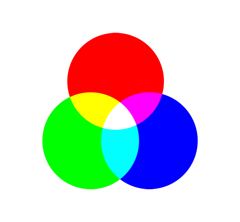
By adding black or white, you get the full gamut of the RGB colour space. There are several variants of the RGB colour space, but the differences will not be addressed here.
The CMYK colour space consists of four primaries: cyan, magenta, yellow and key color (aka black), and is used in printing. Where RGB is a additive colour space, the CMYK colour space is a subtractive colour space.
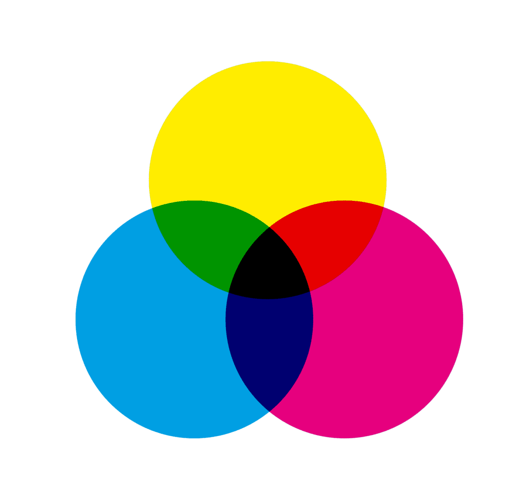
CMYK color codes are noted using 4 numbers, in percentage in cyan, magenta, yellow and black. When cyan, magenta and yellow are at their max, the result is a dark brownish. Black is then added to yield a pure black colour.
Colour schemes
Colours can be combined in various ways to create harmonic color schemes. A colour scheme consists of 2 to many colours, and Itten writes that colours that yield a neutral gray will always work nicely together.
- Monochromatic: all colours are of the same hue but has different values in respect to shades, tints and saturation
- Complementary: two colours that are on the opposite side of each other on the colour wheel
- Triadic: a colour scheme with three colours equally spaced on the colour wheel
- Analogous: a colour scheme where all colours are found adjacent to each other in the colour wheel
Tools for creating colour palettes are found many places online – one is Adobe Color. My initial colour is Yves Klein’s International blue, which consists of 0% red, 18.4% green and 65.5% blue. In hexa colours, the decimals are 002fa7.
This is the Klein blue color. It is 100% saturated and has a ligthness of 32.7%.

Analogous 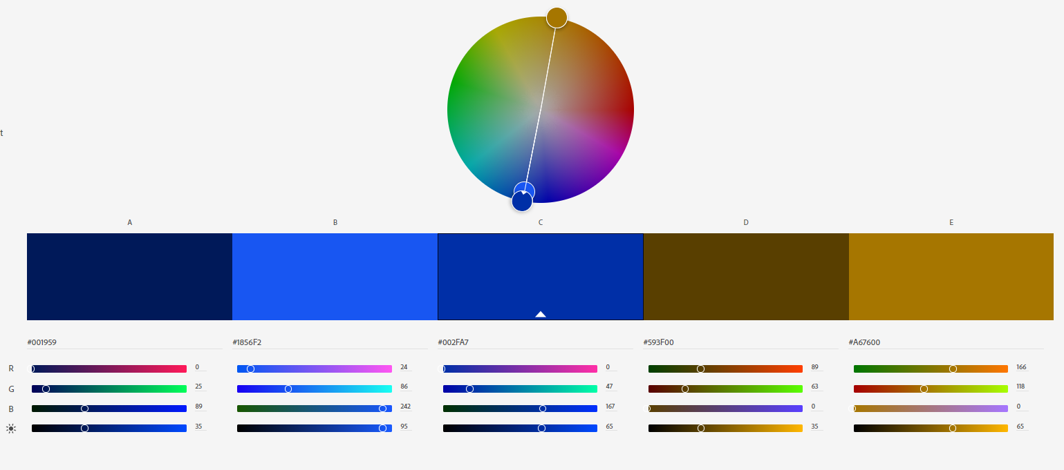
Complimentary 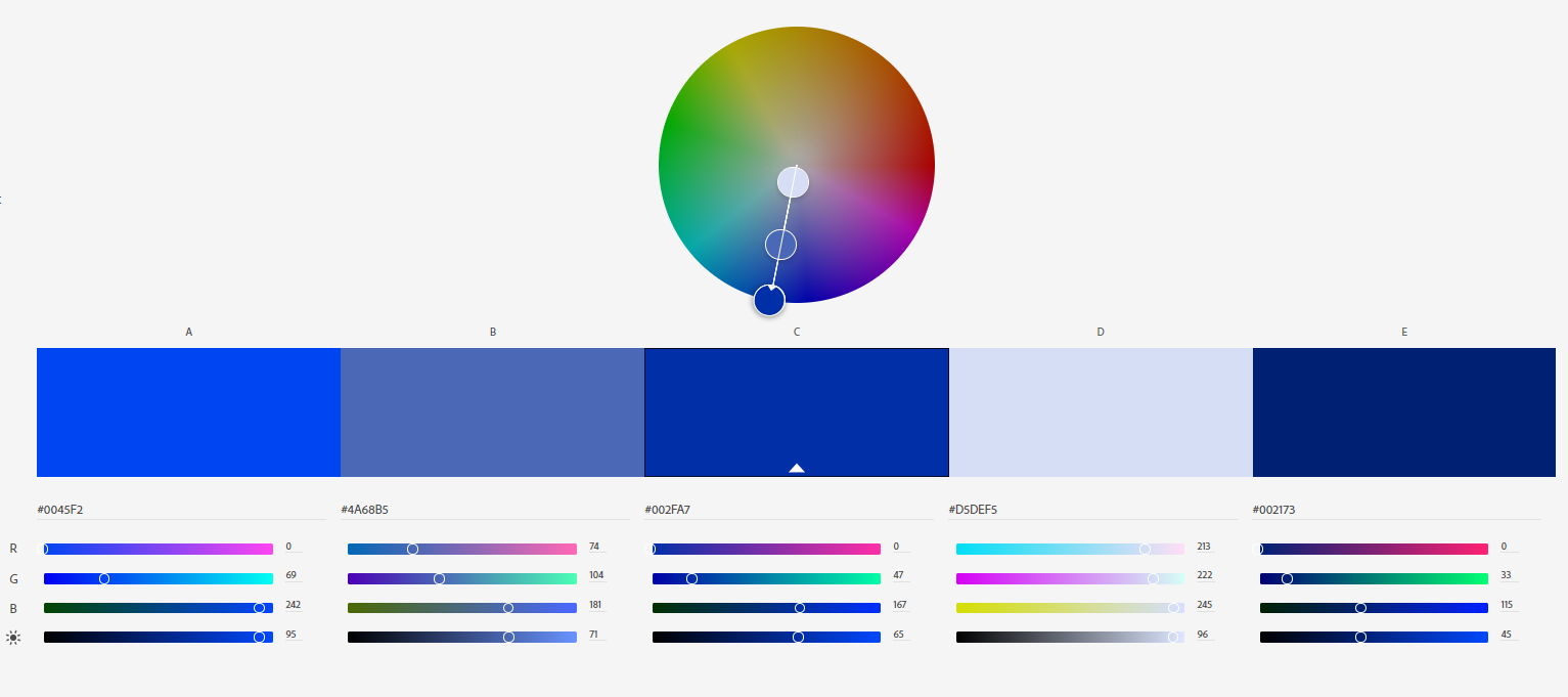
Monochromatic 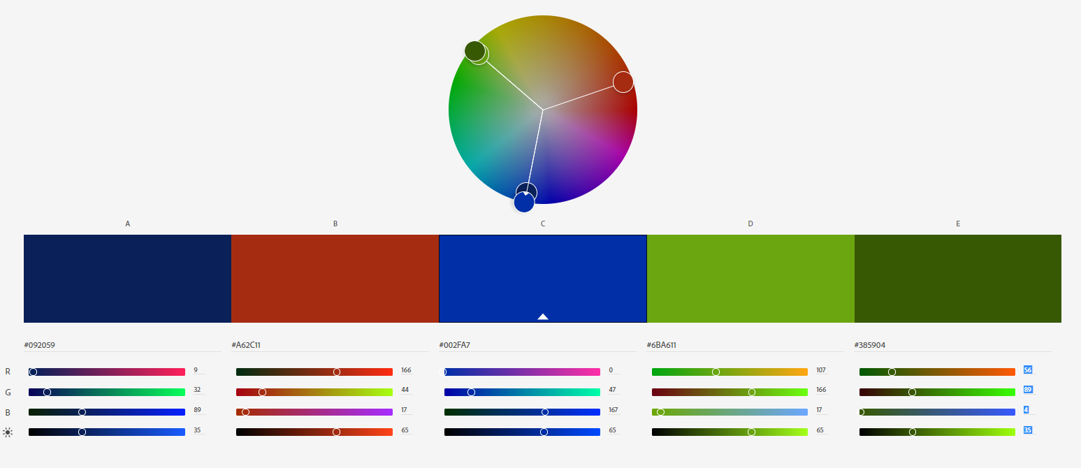
Triadic
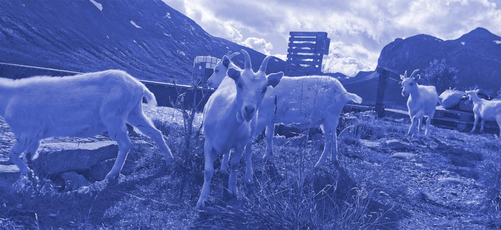
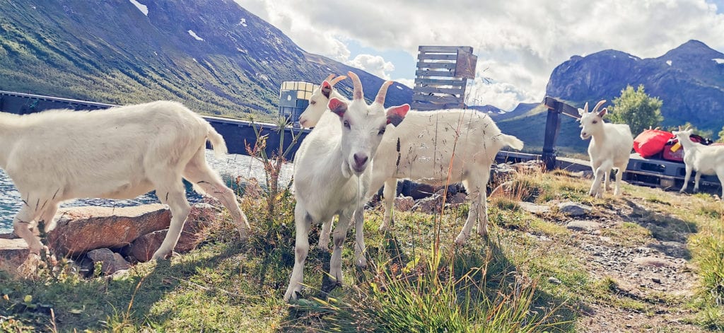
Understanding how colour behaves makes it easier to adjust colours in for example an image. Sometimes colour corrections can be used as effects – to make the colours look a certain way that is not natural. Two examples of this is (fluorecence) duotones and monochromatic. As a mean to learn to control colours in Adobe Photoshop, I have edited an image I shot in Jotunheimen this summer. The image shows a herd of goats at the dock of the ferry going from Gjendebu to Gjendesheim across lake Gjende.
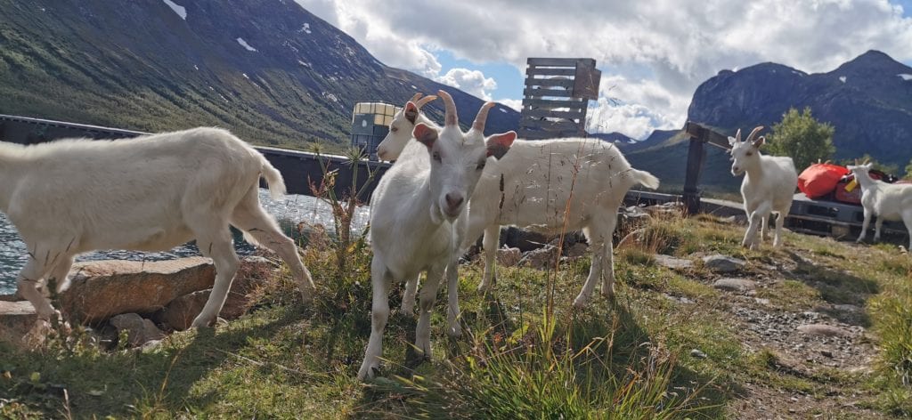
The image quality is not the best, but I experimented with several other images before this one was chosen. The effects works best if there are moderate contrasts in the image, or at least if there are not huge areas with hightlight or shadows.
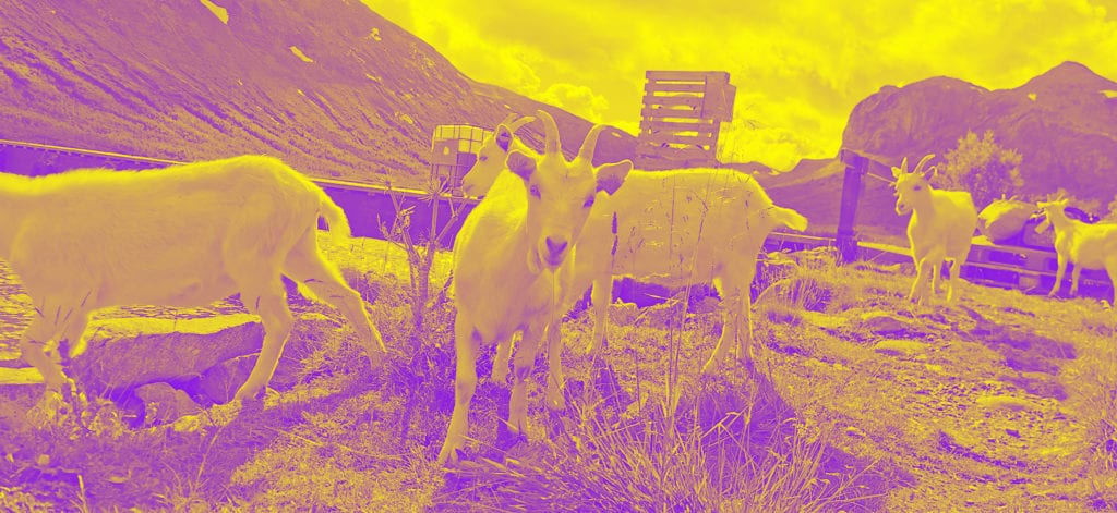
In this image, the effect is duotones, with fluorecence colours. As far as I can tell, fluorecence colours are fully saturated and a high brightness level In this image, I have used a complimentary pair of yellow (at 60 degree) and purple (240 degree). I used the Gradient Map Adjustment Layer and sat the gradient colours to yellow and purple. I tried with other colours too, but the details dissapeared with some colour combinations and with other colours, the image looked like a negative.
In the monochome photo, all the colours are replaced with shades and tints of the selected hue. I chose a blue +230. To optain this effect, I used the colour saturation adjustment layer and ticked for colorize. Then I adjusted the hue slider until I found a colour I liked.
These adjustments does not have the goal of making an image look natural. This does not necessary apply to dual split tone adjustments and selective colour adjustments – the next to variants.
For the dual split tone adjustments, you can change the colour found in the hightlights and shadows. For this image, I chose yellow for the hightlights and blue for the shadows. Since this is a warm summerday, I wanted to recreate the warm feeling of the sunlight. To obtain this, I used split tone adjustments under camera raw filters. To use camera raw filters, you have to convert the image to a smart object first. The adjustmens in the split tone controllers are hue and saturation + balance. The saturation is set to quite low and the distibution or balance is half/half. There is now a yellow cast in the image.
Selective colour correction can be used in various different way. One way is to correct the colour of for example skin tones, another is to change the colour of an object. In this image, the grass is too yellow and the bag in the background is red. I used the selective colour correction adjustment filter to change these. When working with this adjustment, you get access to all channels; red, green, blue, cyan, magenta, yellow, and neutral and black. I tried various combinations before I understood how this adjustment is working. For example, the assumption that grass is found in the green channel was wrong. To change the grass, I had to adjust the yellow channel and drag the slider for cyan all the way to 100%. This makes sense, since yellow and cyan equals green. I also changed the colour of the bag in the background just to see if this could be done. I had to adjust the red channel and add cyan. This one was harder to understand.
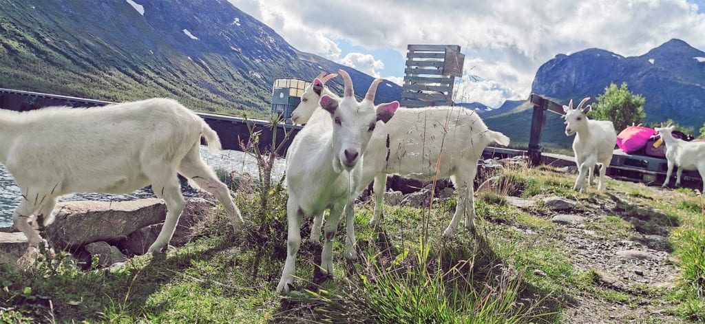
In the result, the grass is greener (and better, in my opinion) and the bag in the background is pink. For the overall image, this adjustments does not affect the overall feeling of the image, but the green grass made it better.