Different types express different moods and feelings, and in this task, I’m going to translate a font and a word into a piece where the typography and the composition ephasizes the word. The first word is a made-up word; browed.
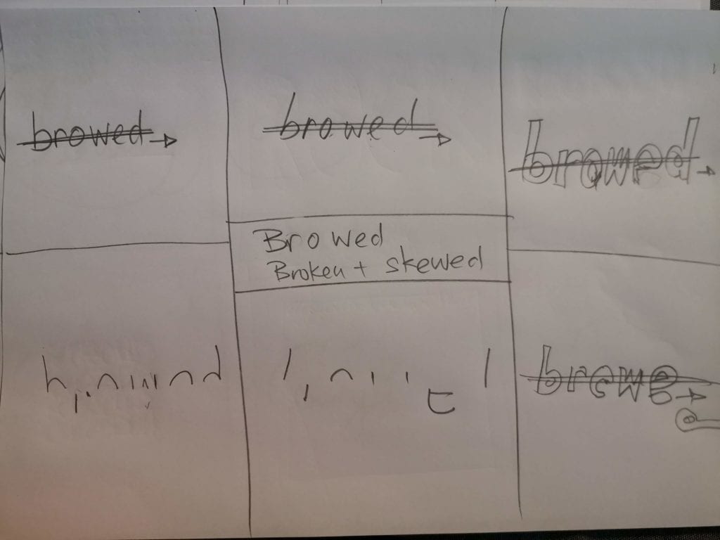
Browed: when something is both broken and skewed.
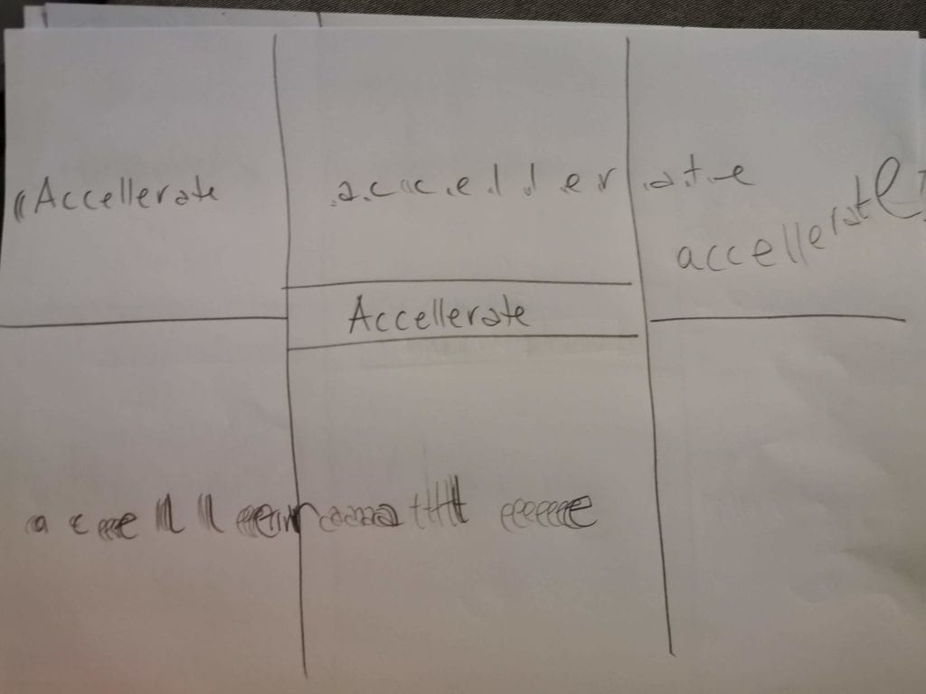
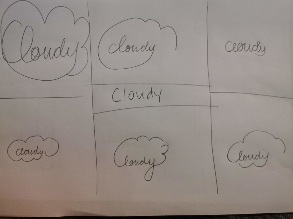
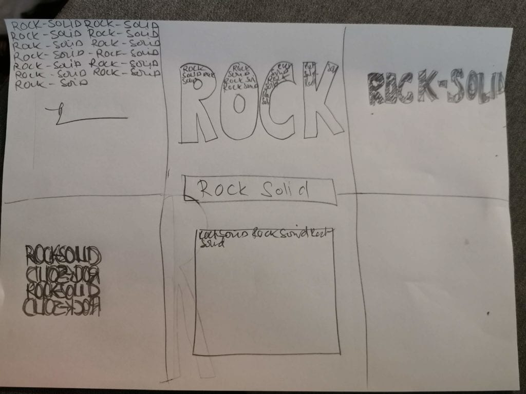
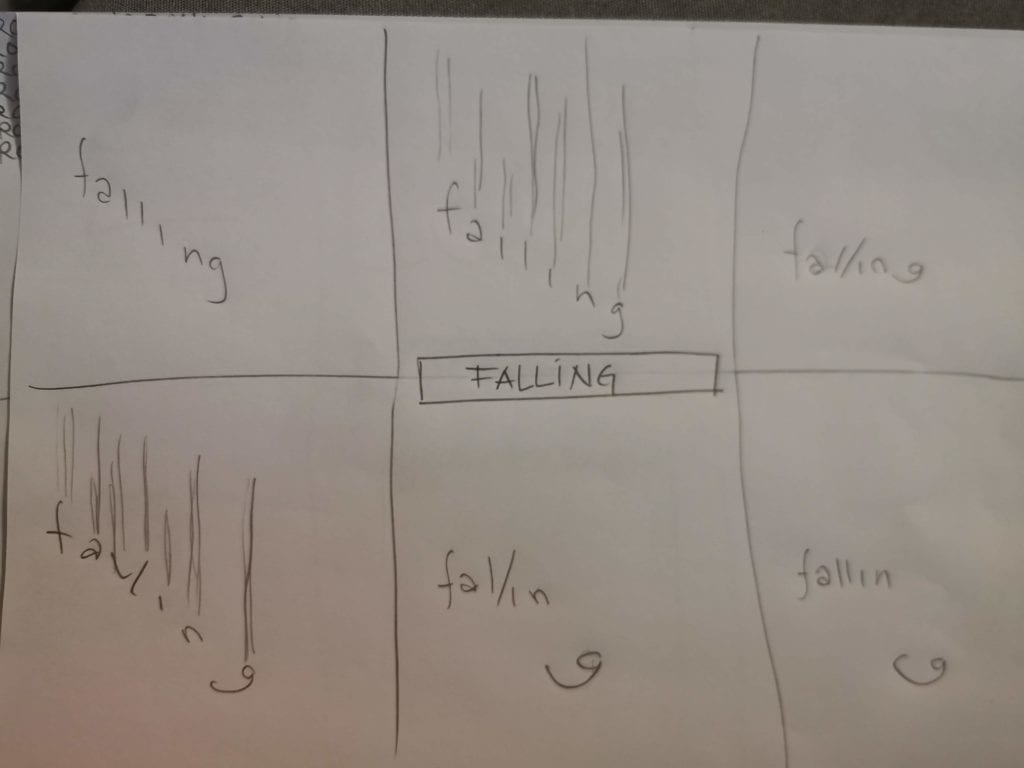
For a made-up word it is hard to find inspiration online, so I explored various options on paper. I used a sketching technique called 6-up brainstorm, that I have used when designing UI for websites and apps. In this technique, I divide a A4 paper into 6 parts, and do rough sketches in each of them. No censuring and no judgement. When this was done, I decided on which one I liked the most and recreated that in Illustrator.
It is difficult to sketch the idea. At least when it is supposed to be fast. The point of being fast is that it is harder to throw away something you have spent alot of time doing. In my sketch, the double line and arrow pointing to the right symbolises that there is a split in the word and the bottom part is moved slightly to the left.
The final composition is in A4 format, 210 mm x 297 mm. It was hard to see the the outline of the composition, so I put on a border in my HTML. The word is quite small, on the bottom left of the paper. When something is both broken and skewed, it is quite sad. In Norwegian, we have a saying “rett vest”, in English translation it would be something like “straight to the west”. This means that something is not going well. On a map, west is to the left.
The next words, were preselected words. I chose “accelerate” and “falling”. I also explored “cloudy” and “rock-solid”.

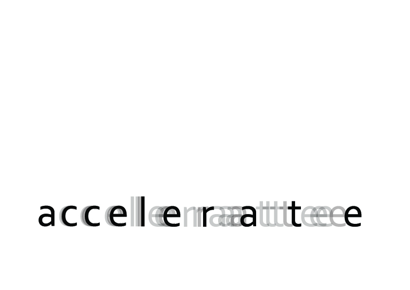
The idea behind “Accelerate” is when acceleration is depicted in comics, it has a movement line behind. Also, when something is accelerating, it goes faster and faster, with more and more distance to the surroundings. When cars accelerate on the roads, the first car speeds up, the second follows – with a little bit of delay, and this delay is enhanced throughout the line. In my composition, the kerning is increased – not by a fixed amount, but largest number of kerning between the last two letters (300) and smallest between the first 2 (30). The letter forms was then converted to outlines for further processing. In this case, it was the shadows.
The shadows are a copy of the original letter, with transparency applied. The numbers of shadow letter varies between letters, but the goal was to almost fill the gap.
Another idea I had was to tilt the letters to the left. For example, when a car is accelerating, the passengers inside are pushed back into their seat until they also reach the same speed as the car. This effect is even more feelable in a plane. However – to tilt something to the left is beyond my Illustrator skills. To tilt something to the right is much easier (italic fonts). I did not want to use the rotate tool, since the base of the letter should remain on the base-line.
The composition is placed low on the paper, indicating a gounded object in movement. If this was for example a plane or a bird, the acceleration would be upwards as well.
The typeface used is a plain sans-serif.
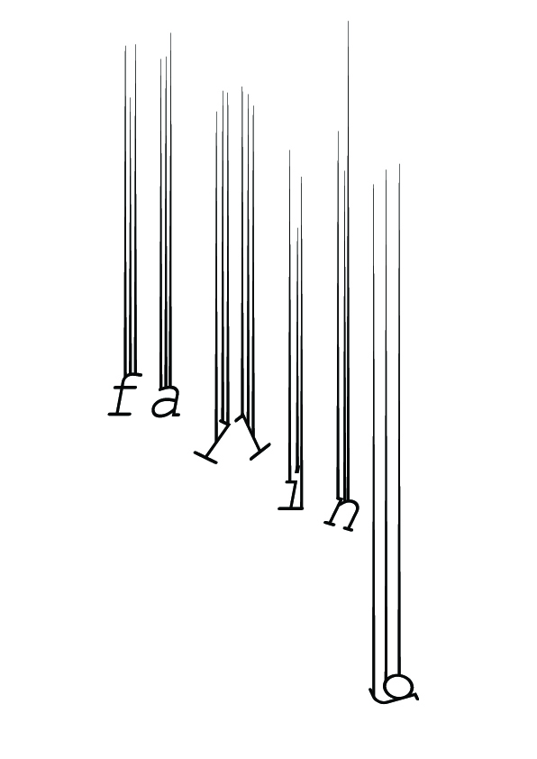
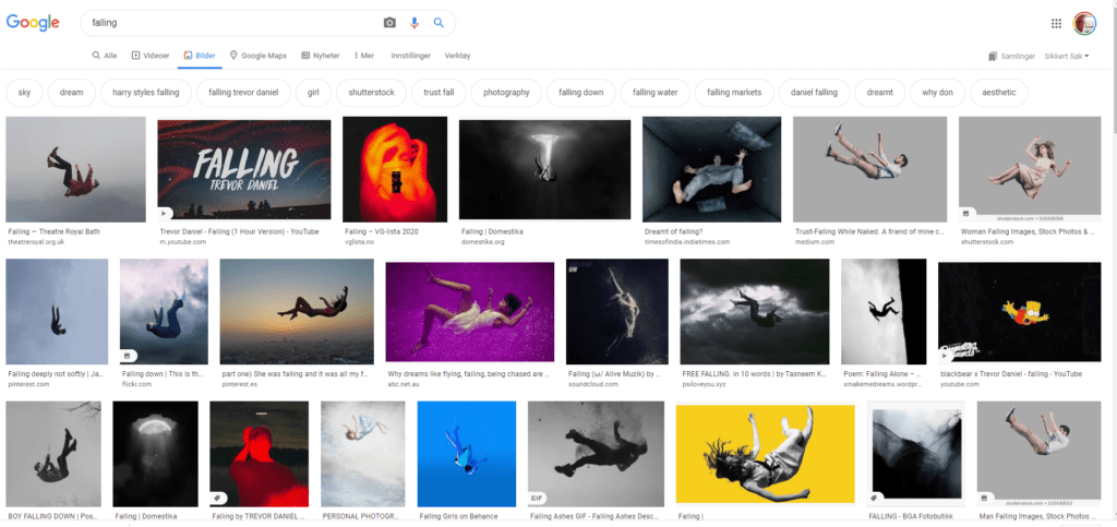
The next was Falling. Falling can be at least two things: falling on the ground – or stumbling, and falling from an altitude. I explored both in my 6-up brainstor sketch. I also did a Google Image search, and a common way to describe falling is arms and legs all over the place. While falling on the ground is much more…. straight lines, falling from the sky is much more dramatic.
When falling is drawn in cartoons, the act is often depicted with lines that indicate movement. I sketched two of them too
I did my favourite in Illustrator: the falling with letters all over the place and with lines indicating movement. The typeface used is a slab-serif italic. In the final piece, I have placed the word and shapes on a portrait A4. The falling movement of the letters required a portrait format. I tried different stroke sizes and stroke ends and landed with a 4px stroke with a tip on top. I tried the tip towards the letters first, but that did not align with the notion that the movement is getting stronger on the way downwards.