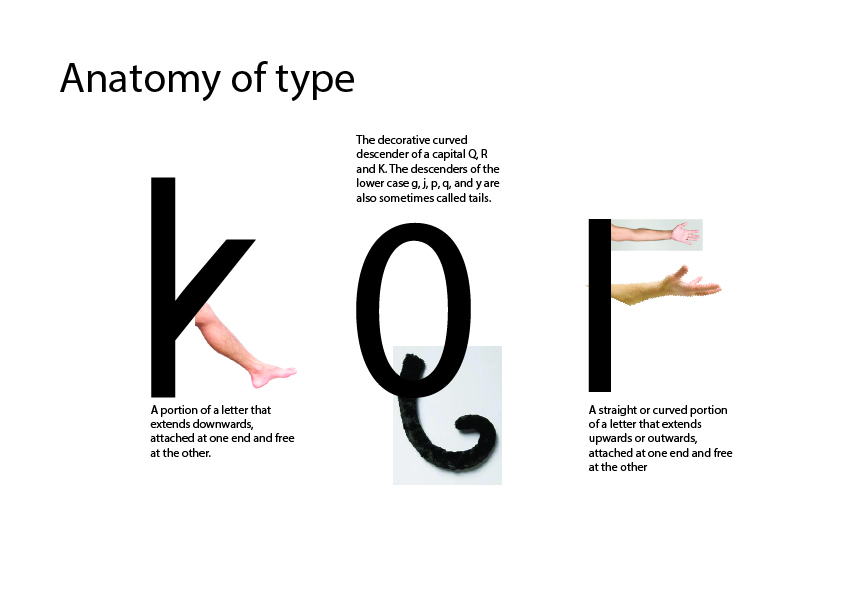
The various letterforms in a typeface consists of many parts. All of them have names, which makes up the anatomy of a typeface. By knowing the names of these parts, it is easier to talk about typefaces in a educated manner, combining typefaces based on properties and categorize various typefaces according to style and historical belonging.
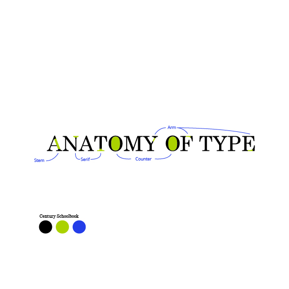
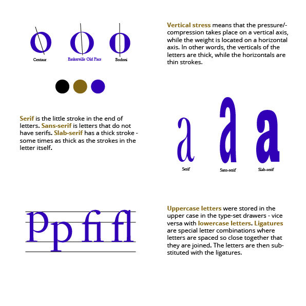
I have created 3 pieces that describes some of the elements of the anatomy of a typeface. The final work is on 210mm x 210mm artboard and finished in Illustrator. The text about vertical stress on piece 3 is from Wikipedia.

Many parts of a letter has names after the human body or animal characteristics. For example, the K has a leg, the q has a tale, the m has a shoulder, some g has an ear. Based on this, I’ve created a piece emphasizing this.