What a week this has been! I’ve been chasing one project after another and my original plan of going on vacation this weekend stranded. It is only 5 days until my next assignment delivery, and I haven’t even started.
Anyway. This weeks lesson was sketching techniques and how sketching can help a designer in their workflow. A design process should always start on paper (as opposed as on the computer. However, I’d say that the design process should always start with research – but that is hopefully a prior step). So – under the assumption that research is done – the design process starts with pen and paper. It is a cheap and easy way of generating many ideas in a short time without the limitations of digital tools. The sketches will help a designer to
- generate ideas quick and easy
- communicate the ideas clearly
- convey ideas to colleagues or clients
You don’t have to be an artist in order to sketch. The details are not important – concepts and communication are.
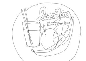
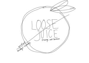
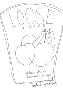
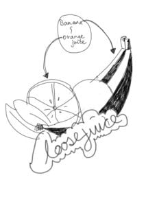
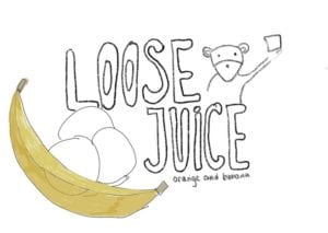
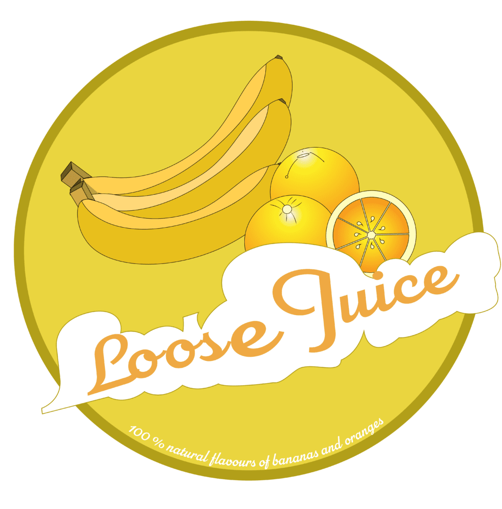
In this week’s assignment, I’m going to do an illustration for a fruit juice label – orange and banana flavour – with the name of “Loose Juice”.
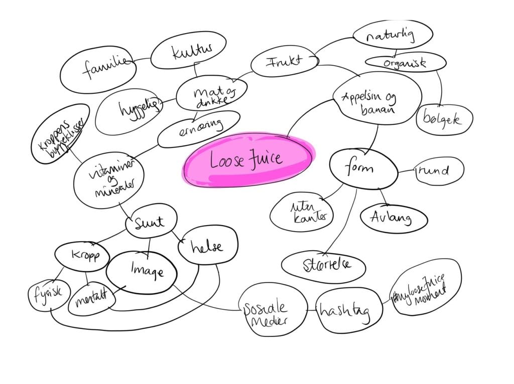
For me, the process started with a mind map with Loose fruit in the center. Then I used mind mappings techniques to generate ideas about a juice with that name and banana and orange flavour. Some words stood out as more important: natural, organic, round, without sharp edges. These laid the foundation for the design. Other words, such as healthy, image, culture, family could also be used, but would require further refinements.
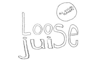
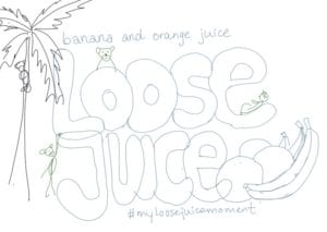
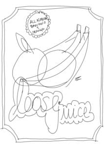
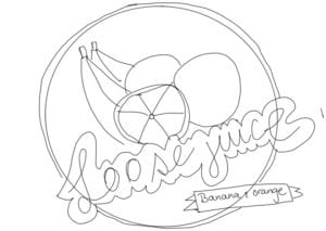
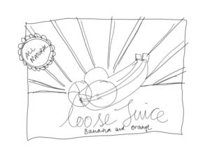
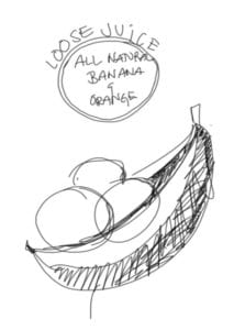
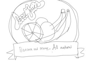
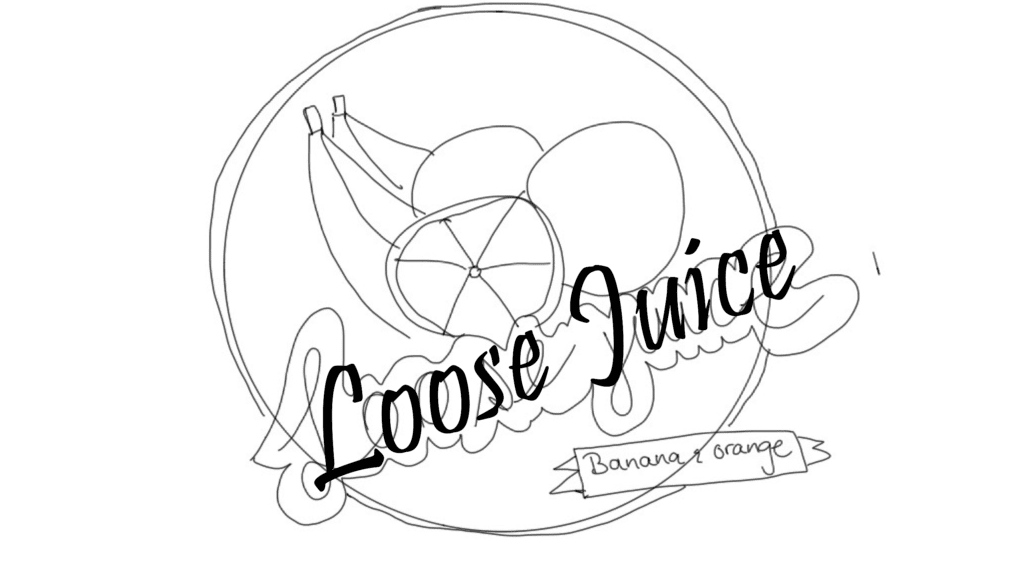
My scamps
The sketches were done on an iPad Pro 12” with an Apple Pencil, in Procreate. For me, this is equivalent to pen/pencil and paper. I can do rough sketches and have no regrets when deleting them.
If you click on them, they get bigger
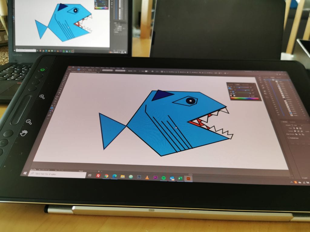
After the sketching was done, I found my favourite and recreated it in Adobe Illustrator. I’ve worked with Illustrator before, at Digital Media design at USN, but not to this extent as I’ve done the last week. I think I’m starting to understand the program, and my drawing tablet Huion Kamvas 16 Pro is definitly helping.
I found an image of some bananas and oranges online, and used a combination of shapes, shape builder, line tool and pen tool to recreate the fruits. The colours does not look natural, but the performance is according to my skills at the moment.
After the fruit was done, I tried a few typefaces for the name. I wanted a handwritten typeface (but ended up with a display) with round edges. I ended up with a typeface from Adobe Typekit; Parkside.
The name and the background is by far the element I’ve spent the most time on. I wanted a background for the name, with the shape of the outer edges of the letters. That was harder than I thought it would be. I ended up cheating alot, and I’m sure there are easier ways to achieve the same or better.
The colours was challenging. What is the color of a banana? I sampled a couple of colors from banana images, but I didn’t like the way it turned out. Furthermore, the illusjon of 3D objects was not easy to achieve either. The oranges got a gradient with a white highlight on top, but the bananas are more edgy. The colour scheme ended up as analoguous – with shades and tints of the orange colours.
