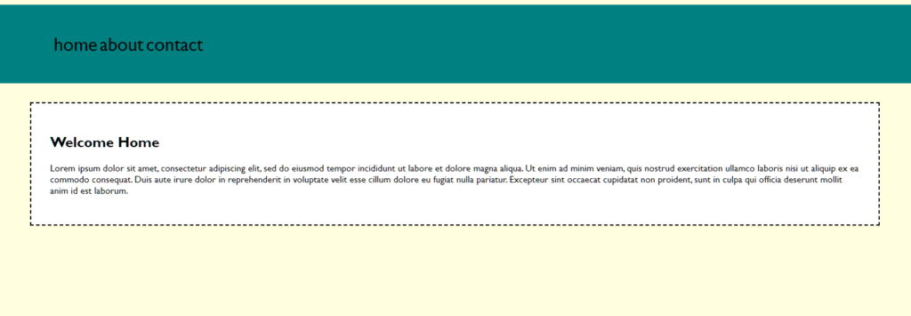
This weeks task is to recreate a layout, and so I did.
body{
	background-color: lightyellow;
	font-family: "Gill Sans", "Gill Sans MT", "Myriad Pro", "DejaVu Sans Condensed", Helvetica, Arial, "sans-serif"
		}
		header{
		background-color: teal;

		}
		nav{
			max-width: 1440px;
			padding: 2rem;
			margin: 0 auto
		}
		nav ul{

		}
		nav li{
			list-style-type:none;
			display: inline-block;
			font-size: 2rem
		}
		nav a:link{
			color: black;
		}
		nav a:hover{
			color: white
		}
		nav a:visited{
			color: blue
		}
		main{
			max-width: 1440px;
			margin: 2rem auto

		}
		main section{
			background-color: white;
			border: 2px dashed black;
			padding: 2rem
		}
The result
The next task was to use flex-box and grids to create a layout. I tried to recreate the layout and styling from the example. This is my result.
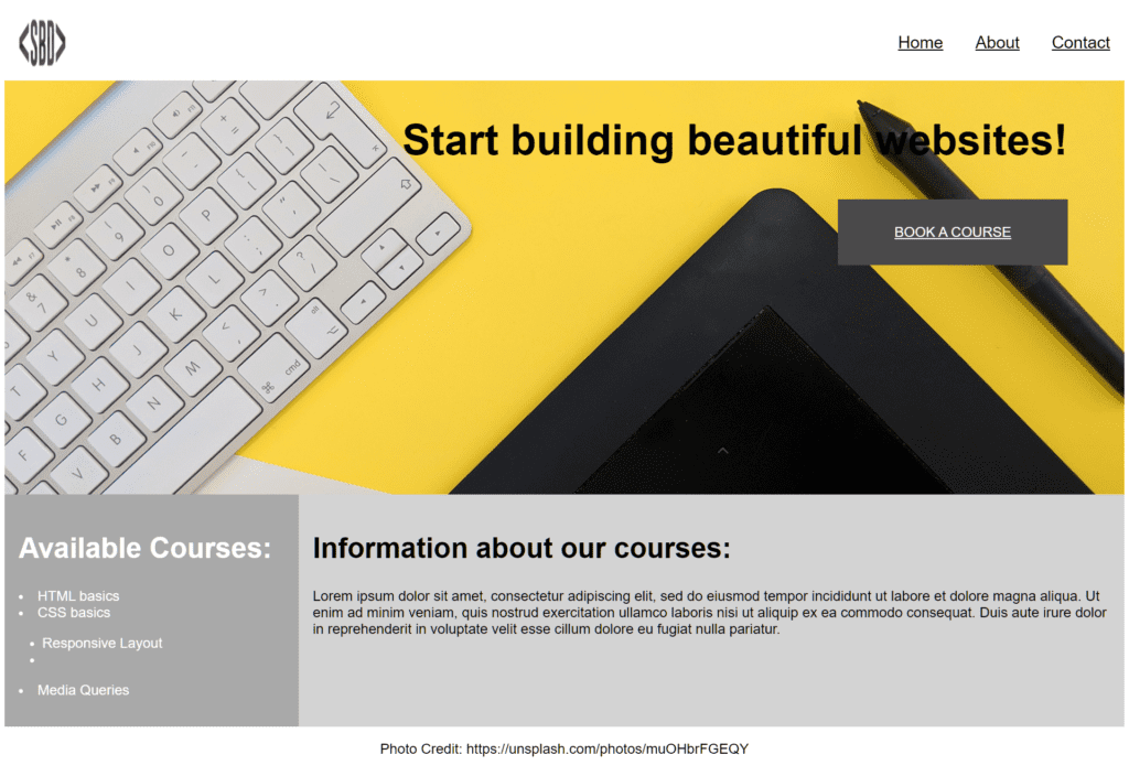
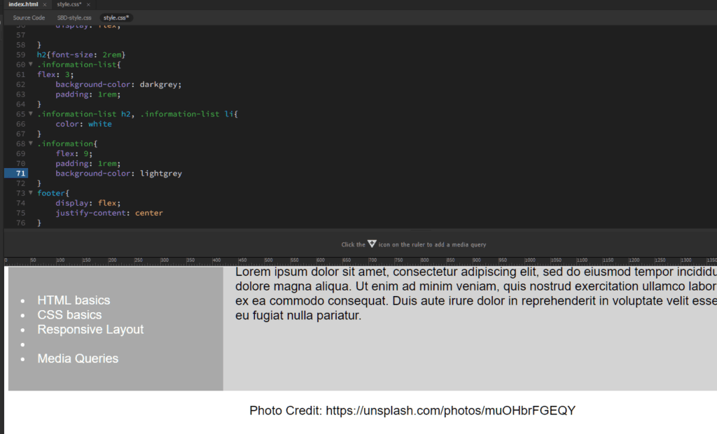
I used 76 lines of css to achieve this.
The next task is responsive design and how to apply media queries to make the site responsive. I transformed the previous mentioned website into a mobile website (768px and smaller). This is the result
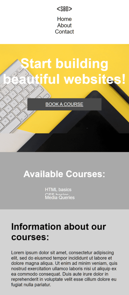
This took 40 lines of code.
