In graphic design (or any design I suppose), the concept of negative and positive space exists. The negative space, or “white space” is empty space, and a common expression is that white space gives the positive space place to breathe. In this lesson task, I’m going to explore the relationship between positive and negative space to see when the distinction between positive and negative space becomes unclear. Is it dominant colour? Shape? Location? Let’s find out.


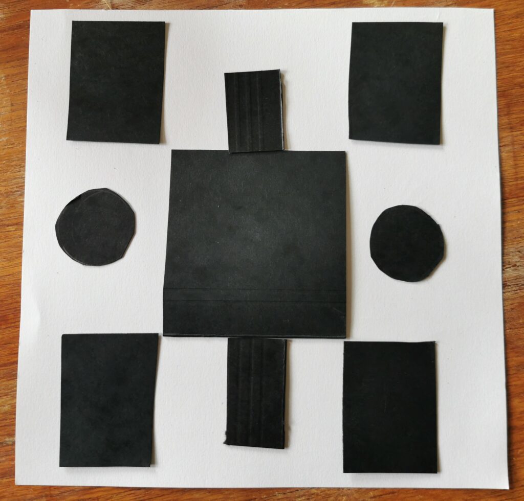
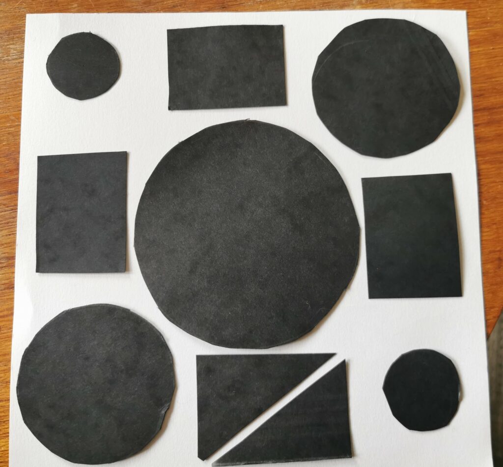
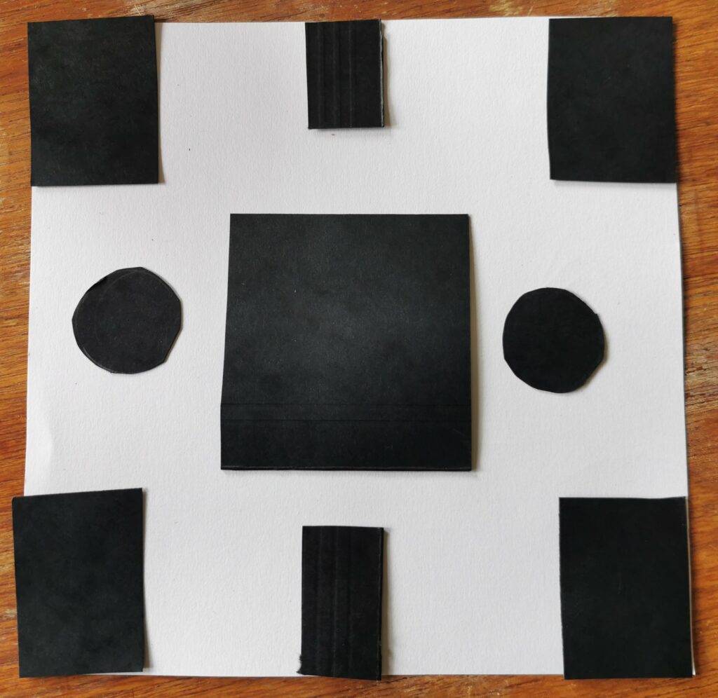
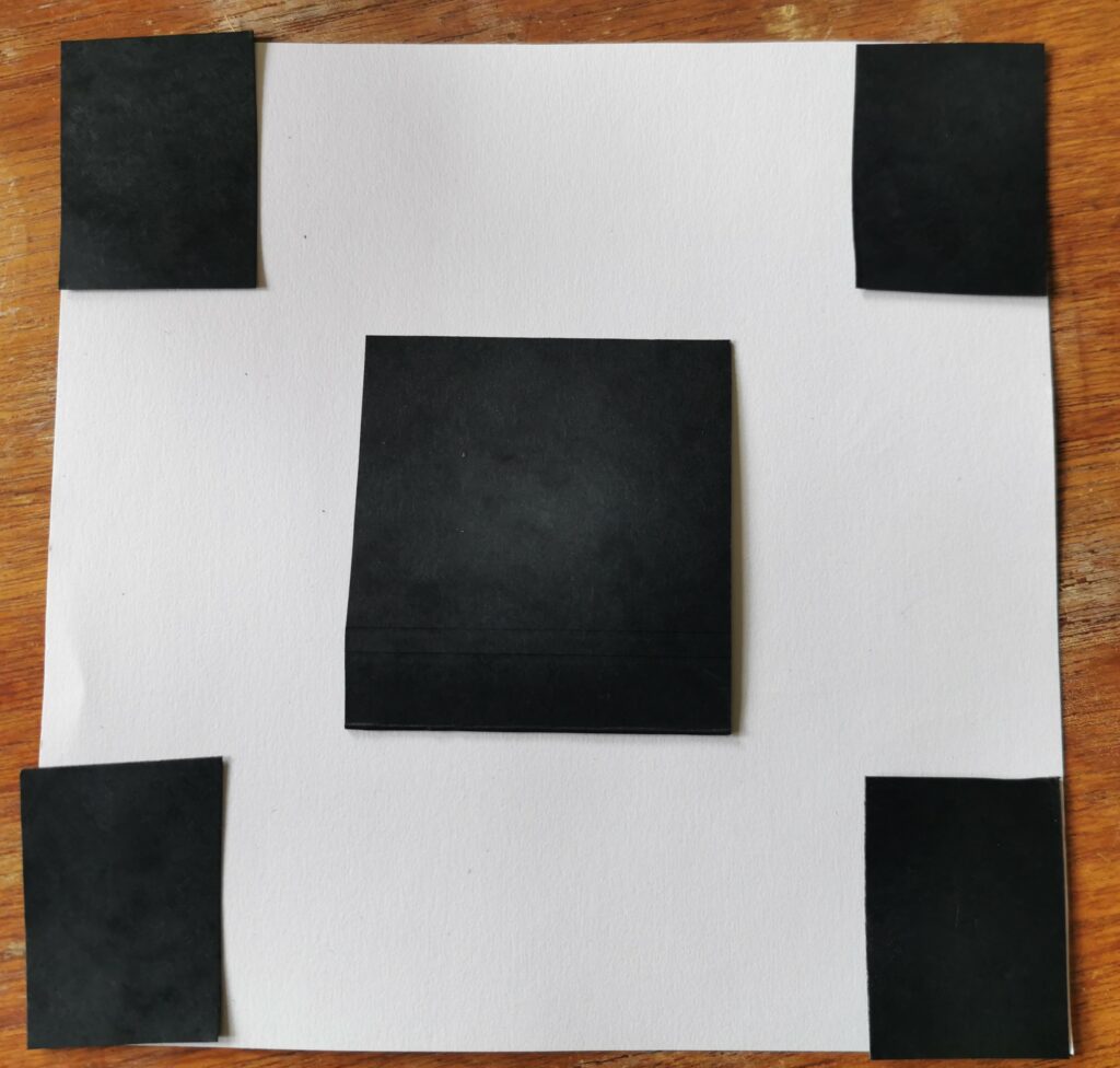
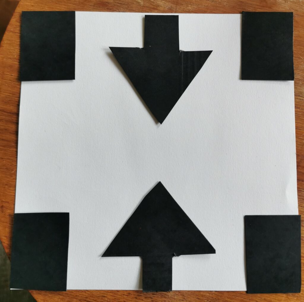
The conclusion I draw from this is that a combination of shape, dominant colour and location contributes to the distinction between foreground and background.
