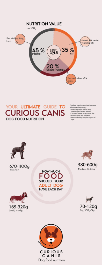
In this project part, the goal is to explore the visual language of a piece and create to coherent designs: one infographic and one brochure that has a common look’n feel, but still are not equal.
In the infographic, the goal is to show in a visual way the nutrition value of the dog food and feeding guide for dogs. In order to get a good understanding of what I am to solve now, I answered 5 questions:
What: visualize the nutrition value and feeding guide for Curious Canis dog food so that people can get a grasp on it without having to read the nutrition label
Why: make dog owners aware of the benefits of using Curious Canis dog food for their dog
Who: dog owners that know or may not know of the brand and the products
Where: online
When: deadline March 18th
I used the same colour palette as in the logo. In addition to Lemon Milk, I also used Josefin Sans regular to complement the typography.

When making infographic it is important to think through how to visualize a data point. For example: there are many ways to visualize the nutrition value of the dog food. For example circle with different sizes, numbers, piecharts etc. In an early version, the values were numbers, but does not show the internal relationship between fats, protein and carbohydrates. I think a pie chart illustrates this quite well.
A dog should be fed according to their weight and activity level. Some dogs are huge and require lots of food and some are small and eats equally less. In order to visualize this, I found images of some typical breeds with different sizes and traced the image in Illustrator.
I then recoloured the image using the recolor tool in Illustrator, to the palette that was created earlier.
Brochure
I was also to make a brochure with the same expression as the infographic. My brochure is made in Indesign, 105mm x 145mm – A5. The colour palette is the same as before. Images were converted to CMYK and 300 dpi or used as ai-files in the Indesign document.


