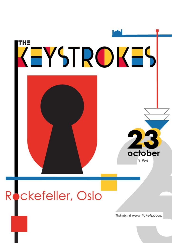
This is the last of the learning assignments where the task is to design a gig poster for a band called The Keystrokes. The poster should contain the band name, the date and the venue, but besides that – I can do what I want.
During the last week I’ve been studying alot of art history, and my favorite period is the Bauhaus period, from 1919-1933. The Bauhaus was an art and design school in Dessau in Germany. Their main idea was that form should follow function, simplicity was a goal and to join art and industry to create a better world. Many known artists originated from the Bauhaus movement, such as Johannes Itten (color theory), Paul Klee, Wassily Kandinsky, Herbert Bayer and many more. Their designs grew out of the concept of basic geometrical shapes, such as circles, triangles and rectangles, and their typography was clear sans-serif typefaces. Herbert Bayer created the typeface Universal in 1925 – a typeface based on geometrical shapes. For example was the O perfectly round.
For my gig poster, I found inspiration in the Bauhaus movement’s way of thinking. The association I get from the word “keystroke” is keys and key holes. The color palette is inspired by the Bauhaus palette in red, blue and yellow in addition to black. I also introduced a gray color. In the Bauhaus way of thinking, functionality should never be sacrificed to form, so my goal was to make a clear poster with a reading direction and a clear visual hierarchy.
I found inspiration online
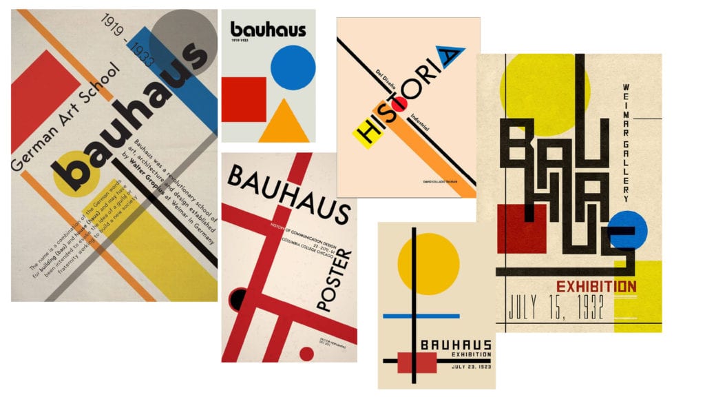
In these posters I found lines, shapes, clear colors, no symmetry yet visual balanced design.
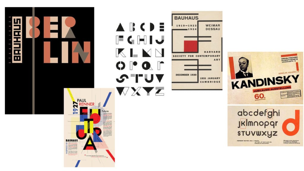
I sketched a few versions, using my iPad and Procreate. The sketches was built using layers, so that I easily could add, move, rotate and scale objects.
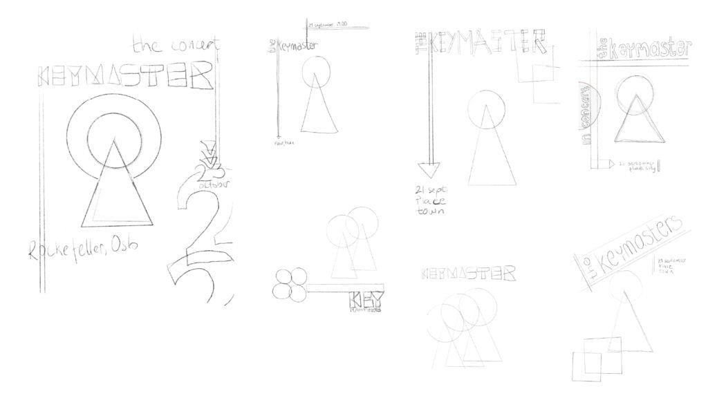
After sketching, I found a versjon that I wanted to work on further, and developed several versions.

The typography of the poster is built on the simplicity of the sans-serif typefaces. The band name, “The Keystrokes” are made with an unaltered typeface called Utopian found at Adobe Fonts website. In the first version, I created my own typeface, put together using rectangles, cirles and triangles -inspired by images found online. However, user testing on my facebook page reveiled that nobody could read the band name, and one said that she didn’t bother to try to decifer it. I believe the current version has better legibility.
The venue, date and extra information is set in Century Gothic – a typeface with wide set-width and medium x-height. I chose it due to it’s circula o and almost round e’s.
The colours are from the Bauhaus palette, with yellow, red and blue and black as primary colours. I found the hex colors by using an extension in my Chrome browser. I also have some elements with no fill colour – they are made up of outlines. In the old Bauhaus posters, I found this too.
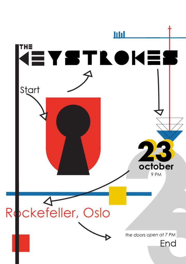
The elements on the poster are put in place with reading direction in mind, and in my opition, the final version shows a clear reading direction. There is an underlying 12 column grid that the elements are (mostly) aligned to.
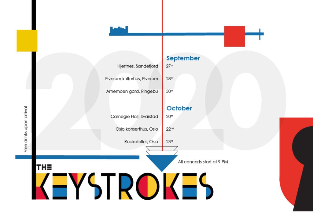
The next part of this task was to create a tour schedule that was visually connected to the poster. I proceeded with copying elements from the poster to the tour schedule and added the schedule in Century Gothic. Again, I have used the arrow – this time pointing to the band name.
The final version of the gig poster
